
flex-direction 排列方向彈性和模型中內部的子元素的排列方向可以通過這個屬性修改,那么我們就一起看下它的使用吧。 1. 官方定義flex-direction 屬性規定項目的排列方向。 2. 解釋flex-direction 用來調整主軸的方向,我們知道主軸默認是水平方向且從左到右,而我們可以通過這個屬性設置主軸的方向,即項目是水平方向從左到右還是垂直方向從上到下或者從下到上排列。 3. 語法div{
flex-direction: row|row-reverse|column|column-reverse|initial|inherit;
}<div class="demo"> <div class="item">1</div> <div class="item">2</div> <div class="item">3</div> </div> .demo{
display:flex; // 讓容器變成彈性盒
flex-direction:row-reverse; 改變項目的排列方向
}4. 兼容性
5. 實例
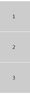
.demo{
display:flex;
flex-direction:column;
text-align: center;
line-height: px;
}
.item{
background:#ccc;
height:px;
border-bottom:px solid #fff;
}效果圖
<!DOCTYPE html>
<html lang="en">
<head>
<Meta charset="UTF-8">
<Meta name="viewport" content="width=device-width, initial-scale=1.0">
<title>Document</title>
<style>
.demo{
display:flex;
flex-direction:column;
text-align: center;
line-height: px;
}
.item{
background:#ccc;
height:px;
border-bottom:px solid #fff;
}
</style>
</head>
<body>
<div class="demo">
    <div class="item">1</div>
    <div class="item">2</div>
    <div class="item">3</div>
</div>
</body>
</html>
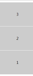
.demo{
    display:flex;
    flex-direction:column-reverse;
    text-align: center;
    line-height: px;
}
.item{
    background:#ccc;
    height:px;
    border-bottom:px solid #fff;
}
效果圖
<!DOCTYPE html>
<html lang="en">
<head>
    <Meta charset="UTF-8">
    <Meta name="viewport" content="width=device-width, initial-scale=1.0">
    <title>Document</title>
    <style>
        .demo{
            display:flex;
            flex-direction:column-reverse;
            text-align: center;
            line-height: px;
        }
        .item{
            background:#ccc;
            height:px;
            border-bottom:px solid #fff;
        }
    </style>
</head>
<body>
    <div class="demo">
        <div class="item">1</div>
        <div class="item">2</div>
        <div class="item">3</div>
    </div>
</body>
</html>
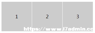
.demo{
    display:flex;
    flex-direction:row;
}
.item{
    background:#ccc;
    height:px;
    width: px;
    border-right:px solid #fff;
}
效果圖
<!DOCTYPE html>
<html lang="en">
<head>
    <Meta charset="UTF-8">
    <Meta name="viewport" content="width=device-width, initial-scale=1.0">
    <title>Document</title>
    <style>
        .demo{
            display:flex;
            flex-direction:row;
            text-align: center;
            line-height: px;
        }
        .item{
            background:#ccc;
            height:px;
            width: px;
            border-right:px solid #fff;
        }
    </style>
</head>
<body>
    <div class="demo">
        <div class="item">1</div>
        <div class="item">2</div>
        <div class="item">3</div>
    </div>
</body>
</html>
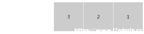
.demo{
    display:flex;
    flex-direction:row-reverse;
}
.item{
    background:#ccc;
    height:px;
    width: px;
    border-right:px solid #fff;
}
效果圖
<!DOCTYPE html>
<html lang="en">
<head>
    <Meta charset="UTF-8">
    <Meta name="viewport" content="width=device-width, initial-scale=1.0">
    <title>Document</title>
    <style>
        .demo{
            display:flex;
            flex-direction:row-reverse;
            text-align: center;
            line-height: px;
        }
        .item{
            background:#ccc;
            height:px;
            width: px;
            border-right:px solid #fff;
        }
    </style>
</head>
<body>
    <div class="demo">
        <div class="item">1</div>
        <div class="item">2</div>
        <div class="item">3</div>
    </div>
</body>
</html>
6. 經驗分享通過 flex 可以做一個上下固定,中間自適應的布局,它常常用于登錄頁那類的布局設置。 <div class="demo"> <div class="head">頭部</div> <div class="content">內容</div> <div class="foot">尾部</div> </div> html,body{
padding:;
margin:;
height: ;
color:#fff;
}
.demo{
height: ;
display: flex;
flex-direction: column;
}
.head,.foot{
flex: px;
background: #000;
}
.content{
flex: ;
background: red;
}案例: <!DOCTYPE html>
<html lang="en">
<head>
<Meta charset="UTF-8">
<Meta name="viewport" content="width=device-width, initial-scale=1.0">
<Meta http-equiv="X-UA-Compatible" content="ie=edge">
<title>demo</title>
<style>
html,body{
padding:;
margin:;
height: ;
color:#fff;
}
.demo{
height: ;
display: flex;
flex-direction: column;
}
.head,.foot{
flex: px;
background: #000;
}
.content{
flex: ;
background: red;
}
</style>
</head>
<body>
<div class="demo">
    <div class="head">頭部</div>
    <div class="content">內容</div>
    <div class="foot">尾部</div>
</div>
</body>
</html>說明:這個布局就是兩端固定,中間自適應的典型寫法,而如果設置 flex-direction:row就變成了左右固定,中間自適應的橫向布局。而他們正是組成頁面的基礎。 7. 小結
|